Inductions - Template Builder
1. Overview
WHS Monitor’s Induction processes are built on our dynamic and highly configurable DataCombs. These provide users with an intuitive, guided and automated incident reporting process to streamline even the most complex incidents and investigations. To build new or customise existing DataCombs, WHS Monitor’s template builder allows users with the relevant permissions to create flexible forms to suit their requirements.
2. Who is This For?
- System Administrators
- Users with relevant access to Induction Template Builder
3. Prerequisites
- Access to WHS Monitor application
- Access to Induction Template Builder
4. Related Articles and Resources
5. Step-by-Step Instructions
Navigate to People from side menu and select Employee Onboarding
- Select Template Builder from the action icon to manage induction templates
- To create a new induction template, select Add New button from the tool bar
- To Edit any existing template, select corresponding Edit icon
6. Adding New Template
A. Enter Details
When creating a new template, users will first be prompted to capture key information and define automatic rules and functions in the Details page:
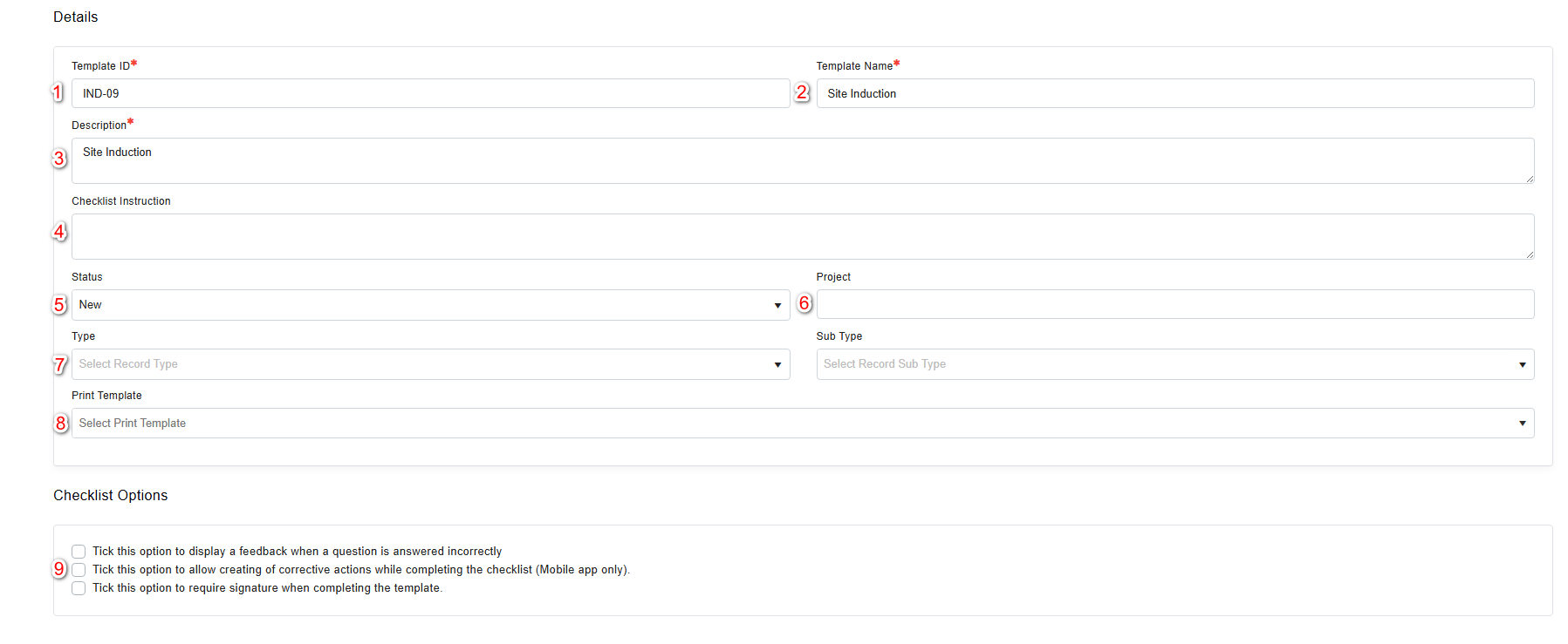
- Template ID – The ID field may be automatically populated with a pre-defined ID, or manually completed by users.
- Template Name – The title should describe the purpose of the template e.g. Site Safety Observation.
- Description – This field identifies the purpose of the template in greater detail.
- Checklist Instruction – Users may provide end users with instructions on how to complete the template.
- Status - This allows users to identify the approval status of a template.
- Type - Types and sub-types can be used to group templates logically, e.g. environmental hazard reports and personal safety hazard reports.
- Project – This field allows users to link templates to an existing Project Safety Plan.
- Print Template – This field allows users to assign a redefined print template to the template, which dictates the format and content that is generated. These can also be customised as required.
- Checklist Options - Users can associate a template with automatic rules that affect the functionality and display:
- Display a feedback when a question is answered incorrectly- Allows users to set feedback to appear when the template is being completed by other users.
- Creating of corrective actions while completing the checklist – This options enables Corrective actions to be added from within the Data Comb on the mobile application.
- Require signature when completing the template – To create accountability, single or multiple signatures can be required when the DataComb is completed by other users.
B. Checklist
The Checklist enables users to create and customise dynamic and flexible DataCombs to capture and record induction information.
From the Checklist, users are able to:
- Edit Details that were previously entered. For example, once the template is complete, the status can be changed from Draft to New.
- Save to ensure any changes are captured. As progress is made with the template, changes will also be auto saved.
- Add Sections to group fields together and provide a logical flow to the DataComb.
- Add Fields to capture the desired data. Based on the selected field type, users may be required to type a response, upload an attachment, or select an answer using a checkbox.
Sections
Sections and Sub-Sections allow fields to be grouped together logically for ease of navigation when completing the DataComb.
Fields
Fields are conditional data capture fields which prompt users to interact with a DataComb. Fields can also include action functions to capture comments, photos, assign actions and conduct a dynamic risk assessment based on the responses given.
The types of fields are:
- Plain text – Introductory text in the form of a heading, body of text or image.
- Textbox – This field type prompts a user to type a response to a question.
- File Upload - Files can be uploaded to this field, e.g. PDFs or photographs.
- Map - This field type allows users to pinpoint a geographical location.
- List box – Displays answers for users to select in a drop-down list.
- Yes / No - Displays preset options for the user to select.
- Yes / No / N/A – Displays preset options for the user to select.
- Checkboxes – This field type is ideal for multiple choice questions, especially when the text accompanying the choice is longer.
- Multi Select - This field type is ideal for multiple choice questions with succinct answers.
- Single Select – Ideal for questions that only have a single answer from multiple options.
- Date and Time – This will prompt the user to select a date, time or date and time.
- Dataset – This type of field will display specific data from other modules within the system in a table or drop-down format. For example, a dataset dropdown may be used to list all workers of a certain role from Manage Workers.
- Task – Tasks allow for field action functions to be enabled. For example, to prompt the user to complete a risk assessment.
- Multiple Response Field Groups - Fields groups allow users to define groups of multiple fields which are easily selectable from predefined templates. This field type should be used to group several types of fields into one response for a question. For example, a text area and dataset can be included for a single question. Once saved, Field Groups can be added to new or existing templates within the Template Builder.
- Notification – Once completing the DataComb, this field allows the user to send the text to other users.
Field Settings
Depending on the field chosen, different option tiles will appear to set up and configure the field as desired.
- Settings – Allows for the configuration of the field and connected actions.
- Field Rules – Allows users to select how the field behaves, such as marking as mandatory. All options are selected by default.
- Field Settings – Allows for additional functions to be enabled for the field, such as comments, photos, actions and dynamic risk assessment.
- Field Settings Display Options – Allows users to select when the additional function buttons are displayed, either by default or when the field is answered incorrectly.
- Field Selections – For multiselect fields, this section allows users to input custom pre-set options and mark if the option is valid or incorrect.
- Field Visibility Rules – Allows users to establish conditional questions that only appear if a previous field has a particular response selected. E.g. Only if a user selects YES for 'are hazardous goods stored on site?' does 'are hazardous goods appropriately stored?' appear as the next question.
- Sub Text – Enables users to add any clarification or additional information instantly formatted as sub-text.
- Points of Concern – Enables users to select how Points of Concern should be created; either generated from the comments or from a specific points of concern entry if the response is incorrect.
- Data Configuration – For Dataset fields, these settings allow users to select a data source for the field, including the option to filter the data displayed.